collaboration with
IED Torino | Piedmontese Foundation
for Cancer Research - ONLUS
created with Carlotta Andreotti
and Federica Battistoni
Concept design
Editorial design
Infographics
ui/ux
coding
IED Torino | Piedmontese Foundation
for Cancer Research - ONLUS
created with Carlotta Andreotti
and Federica Battistoni
Concept design
Editorial design
Infographics
ui/ux
coding
Restyling of the
"Foundation" newspaper
Thesis project
a.y. 2019-2020,
IED Turin
"Foundation" newspaper
Thesis project
a.y. 2019-2020,
IED Turin
Restyling of the "Foundation" newsletter of the Piedmontese Foundation for Cancer Research - ONLUS.
Printed at "L'Artistica Savigliano", in Savigliano (CN)
Printed on Shiro Alga paper Favini paper
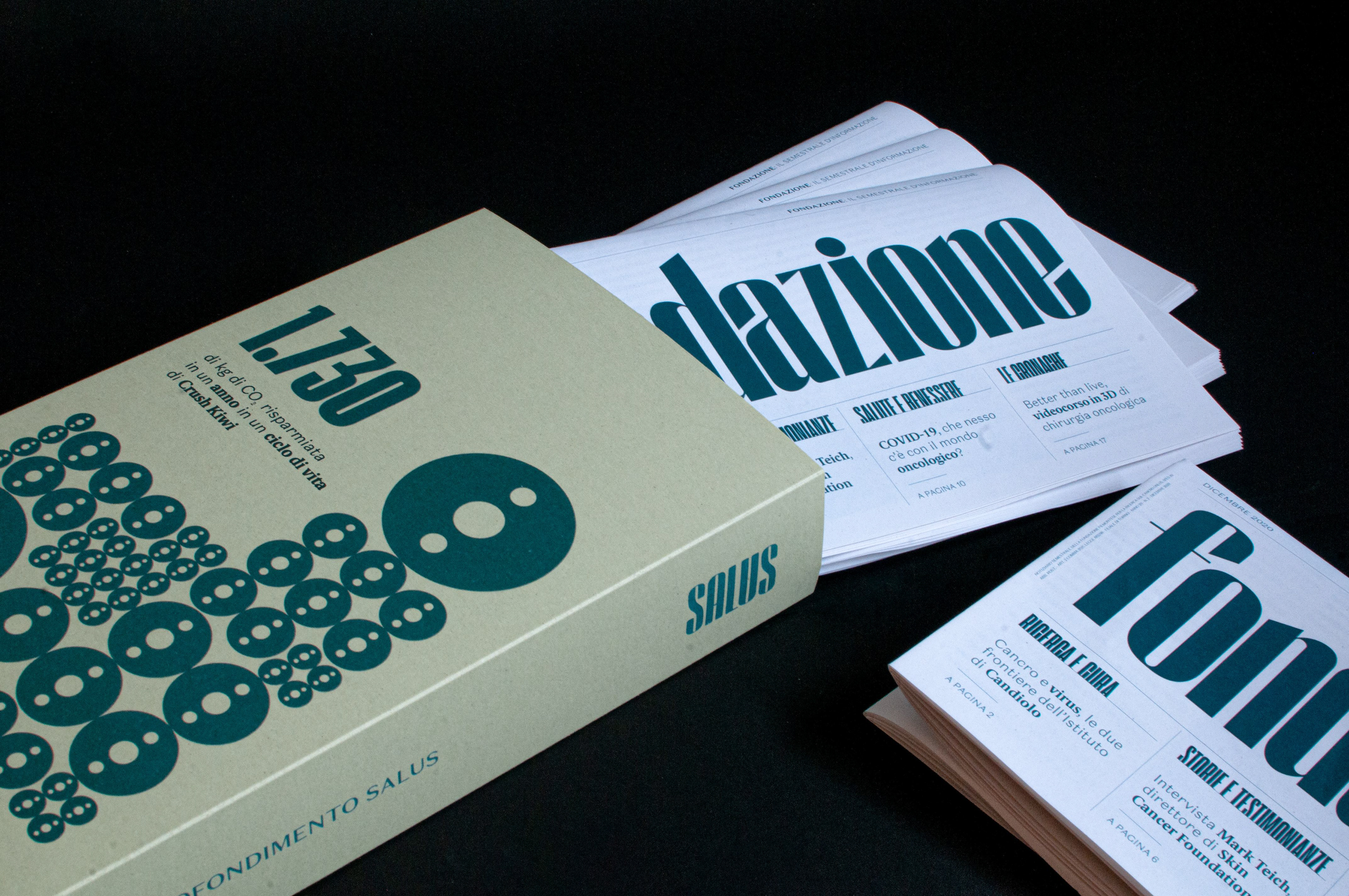
Collectible container printed on Crush Kiwi paper by Favini
Cards purchased at "Paper & People", Milan (MI)
Music from the video by concept by iENAduo
______________________________________________
a newspaper for in-depth scientific - oncological
Proposal for restyling of the "Foundation" newsletter of the Piedmontese Foundation for Cancer Research - ONLUS. Thesis project a.y. 2019/2020 - IED Turin
The Piedmontese Foundation for Cancer Research Onlus is a body capable of combining scientific research with clinical practice and making the best human and technological resources available today available to cancer patients.
The Foundation currently addresses a group of loyal supporters through an eight-page six-monthly periodical which illustrates the latest activities and news relating to the work of the Institute and its scientific progress. This is a valid means that the Foundation has been using for several years but risks not guaranteeing the completeness and continuity of the information.
For this reason, the Foundation wanted to undertake a path of collaboration with the graduating students of the Triennium of Visual Arts address Graphic Design of the IED in Turin, with a focus on the possibility of expanding the pool of supporters and readers of the newsletter, also reaching touch the interest of young students.
Website that collected the results of the preliminary research on the Foundation
Research was then conducted on the Foundation, and specifically the topic relating to the production and distribution of the periodical was investigated.The phases of the life cycle of a newspaper and the production processes used were analyzed, and a reflection was born on how these processes can be improved in favor of greater sustainability. It would be worth evaluating other methods of use in distribution and production that have a reduced environmental impact, in line with the vision of the Institute.
The current newsletter has a short duration, because once read, and therefore after having exercised its informative function, in most cases it is thrown away and then recycled (up to 7 times).It is well known that the product has different life stages: it is born (extraction of materials), is transformed (processing of the same), travels (transport), lives (use phase) and dies (disposal). For each of these phases, the ecological impact of the object can be monitored and, based on the results obtained, the environmental performance of the critical phases can be improved.
The current newsletter has a short duration, because once read, and therefore after having exercised its informative function, in most cases it is thrown away and then recycled (up to 7 times).It is well known that the product has different life stages: it is born (extraction of materials), is transformed (processing of the same), travels (transport), lives (use phase) and dies (disposal). For each of these phases, the ecological impact of the object can be monitored and, based on the results obtained, the environmental performance of the critical phases can be improved.
Presentation video of the concept - music by iENAduo
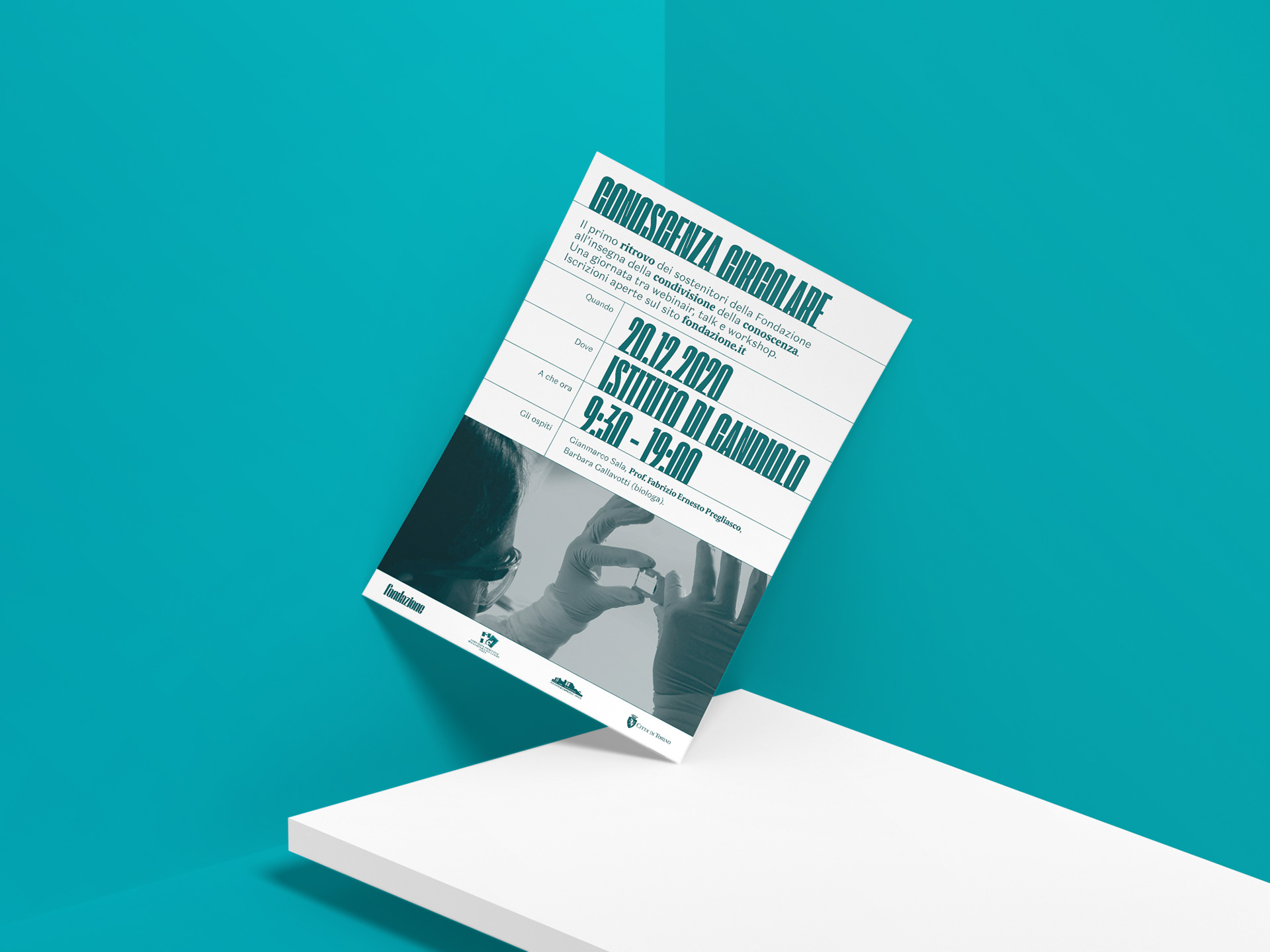
What was collected in the preliminary phase was developed in a concept that revolves around the idea of a circular approach, and the principles of awareness, consistency and ethics. The name chosen to best express this concept is SALUS, a Latin transposition of the Greek divinity Hygeia, goddess of health, and whose meaning is synonymous with "good health". The idea is to give the Candiolo Foundation a new communication more in line with its principles of health protection and respect for the person, thus adopting an approach to design with methodologies and materials that allow the product to be filed and returned. so long-lasting. Following this principle, the entire project aims at zero impact through the Life Cycle Design method, a practice that rethinks the entire life cycle of the product or service from an innovative perspective. The aim of the project is to give a new continuity to the product which is thus re-evaluated as an archival object. The archive is in fact the recurring element that characterizes and binds every identity support, in terms of circular design, durability and continuity.

| newspaper in your hands
The paper newsletter
Presentation of the newsletter in its collector's box
In the preliminary phase of analysis and research, a questionnaire is submitted to a sample of 60 supporters, with the aim of narrowing the scope for the definition of an innovative concept and a targeted proposal. This survey showed that most readers tend to keep and archive the newsletter. This reinforced the initial design idea of focusing on the durability and collectability of the product. Thus, on the one hand, the contents of the newsletter were enriched, and on the other hand it was decided to provide the reader with a practical container for archiving the "Foundation" numbers.
The principles of collectability, sustainability and attention to well-being guided the design and resulted in a refinement of interesting and in-depth content, low environmental impact materials and particular attention to the legibility of the texts, and to the clarity and visual translation of the Topics covered
The paper chosen for the publication of the newsletter is Favini's Shiro Alga Carta, an internationally renowned paper mill that actively engages in projects in favor of eco-sustainability and boasts numerous recycled, ecological and biodegradable papers in its catalog. Also for the material of the archive container, the choice fell on a paper from the Favini range, in this case a Crush Kiwi, made with agro-industrial by-products.
The ink and the printing process are other aspects that should not be underestimated. For this reason, the newsletter is printed in a single color used at different opacities, which allows you to operate with a view to optimizing the production process, both in terms of costs and sustainability.
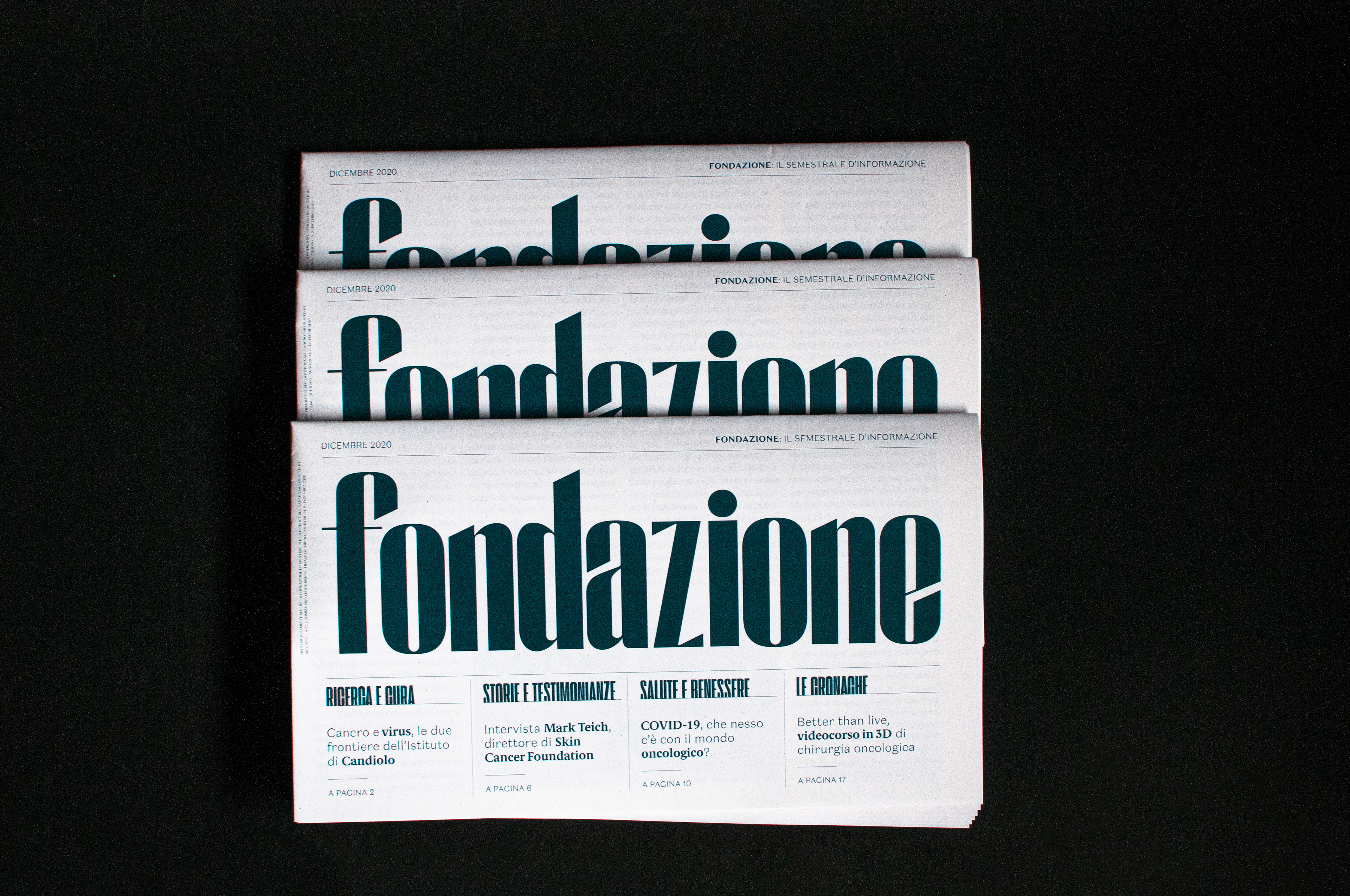
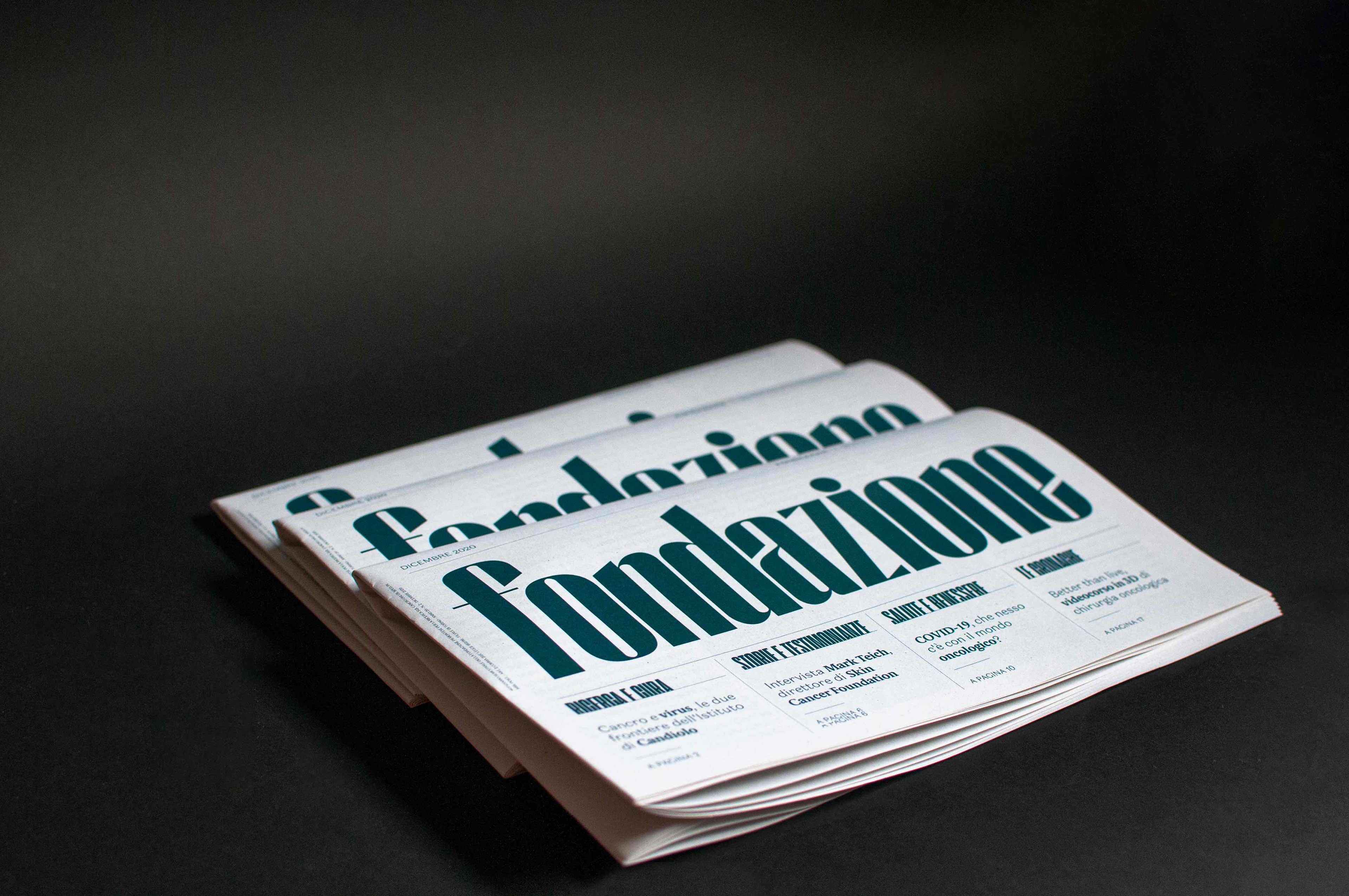
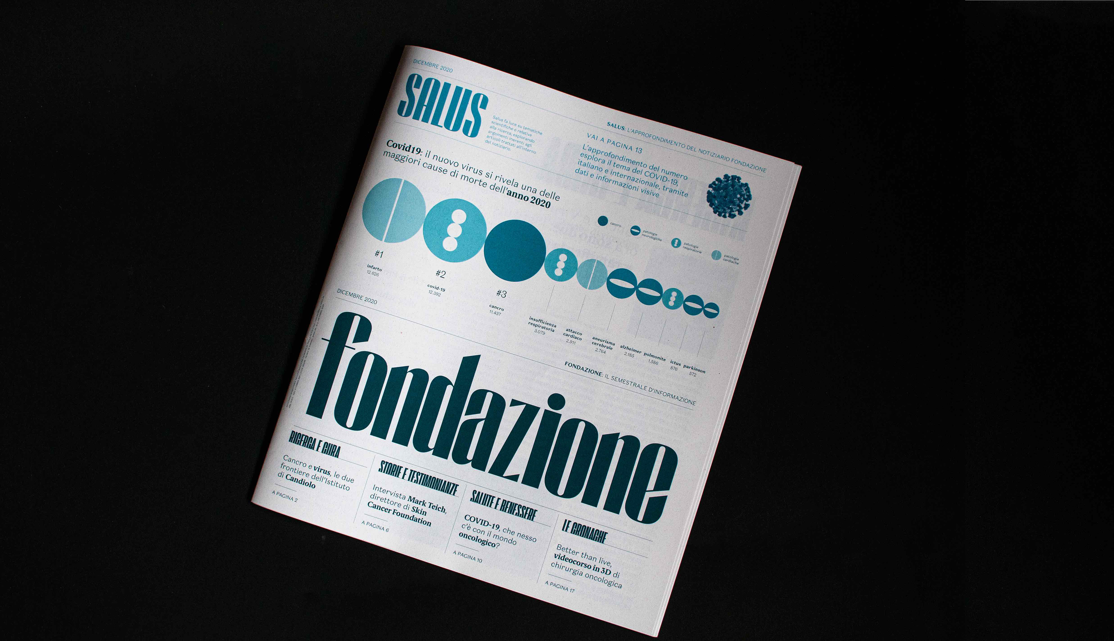
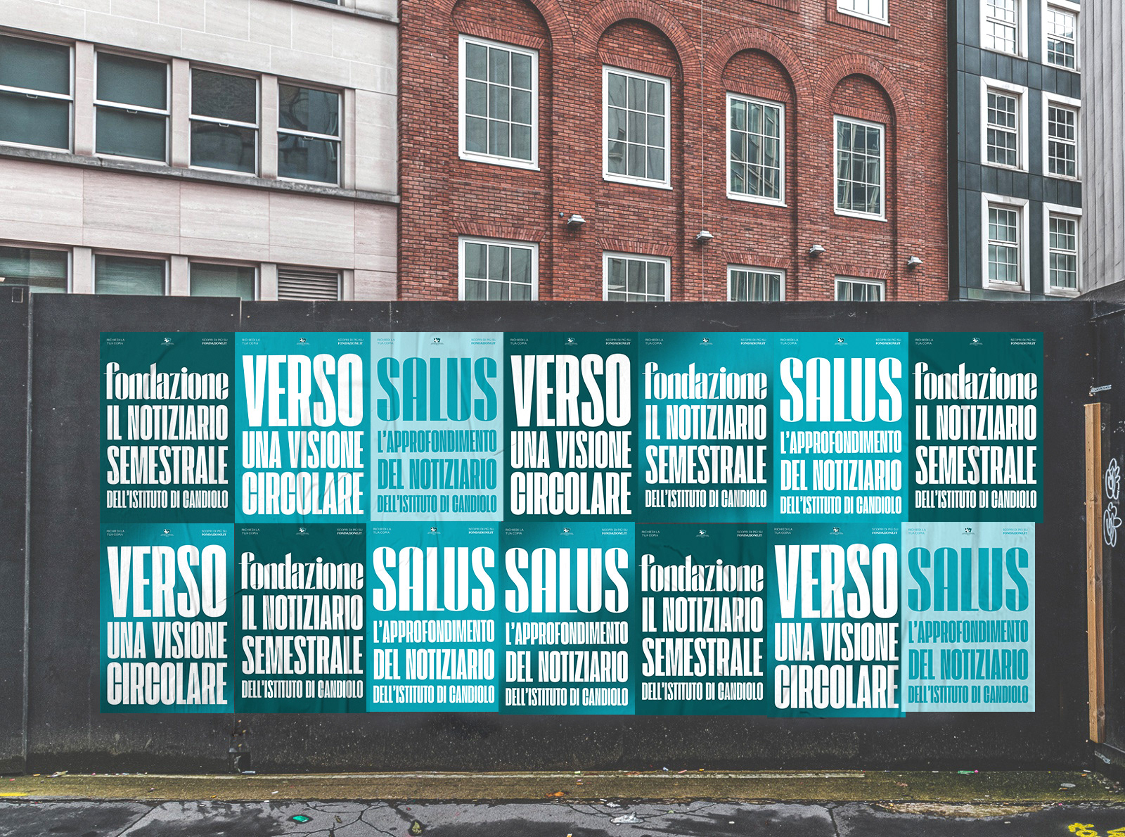
On a graphic and visual level, the aesthetic choice focuses on a massive use of typography, playing with shouted and impactful titles that recall the world of the archive.
This visual reference is also taken from the combination of two different typefaces used for the titles.The layout is clean, and is designed to be pleasantly legible.The layout of the elements on the cover was designed according to the fold on the horizontal axis.
The space is divided into two areas: one dedicated to the "Foundation", and a higher one for the study of "Salus", which also covers the same position on the internal pages.The newsletter arrives in the homes of supporters folded and bagged so that the headline is immediately visible. Upon opening, the entire contents of the cover are then revealed.
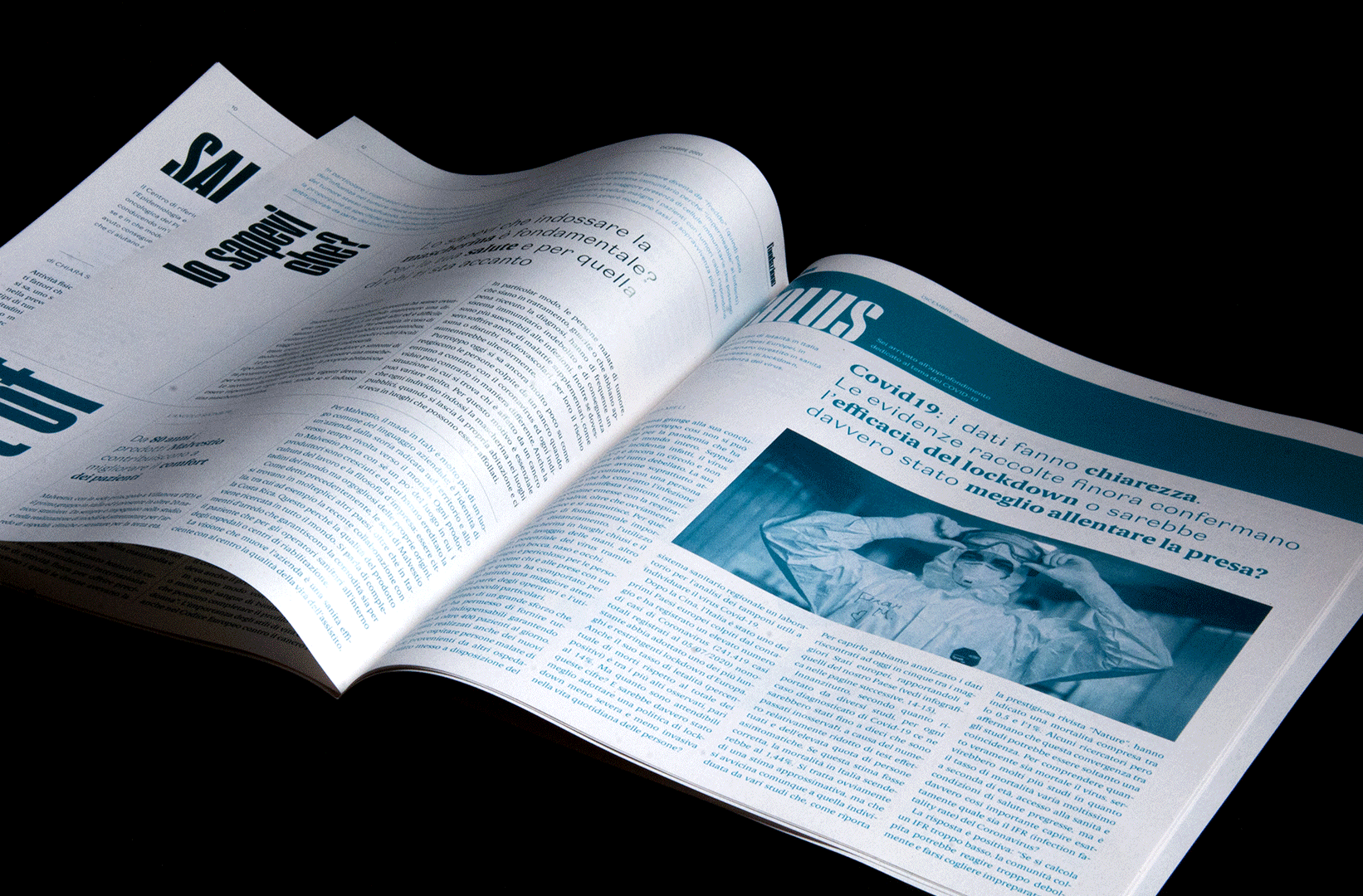
Newspaper' pages
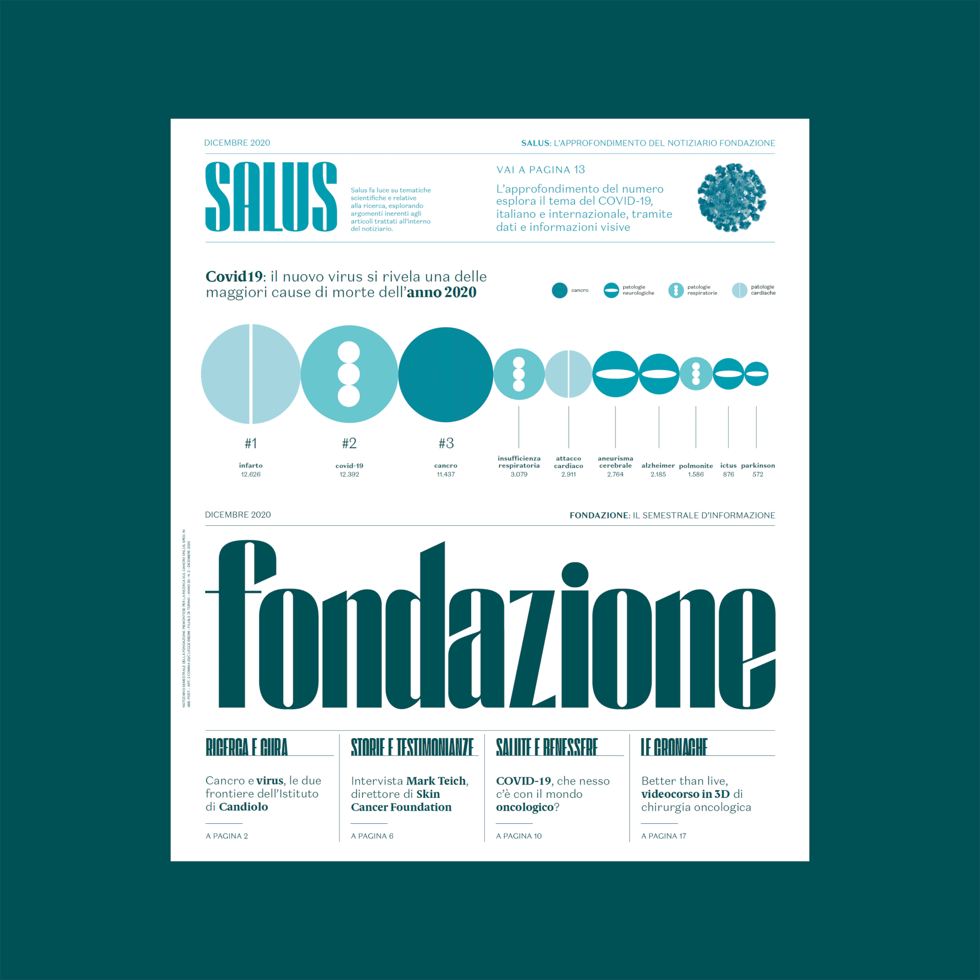
The newspaper consists of 20 pages divided into four sections, but linked by the constant and continuous presence of in-depth content positioned at the top of the sheet.
The four sections are:
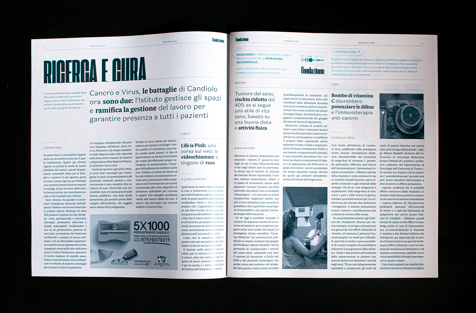
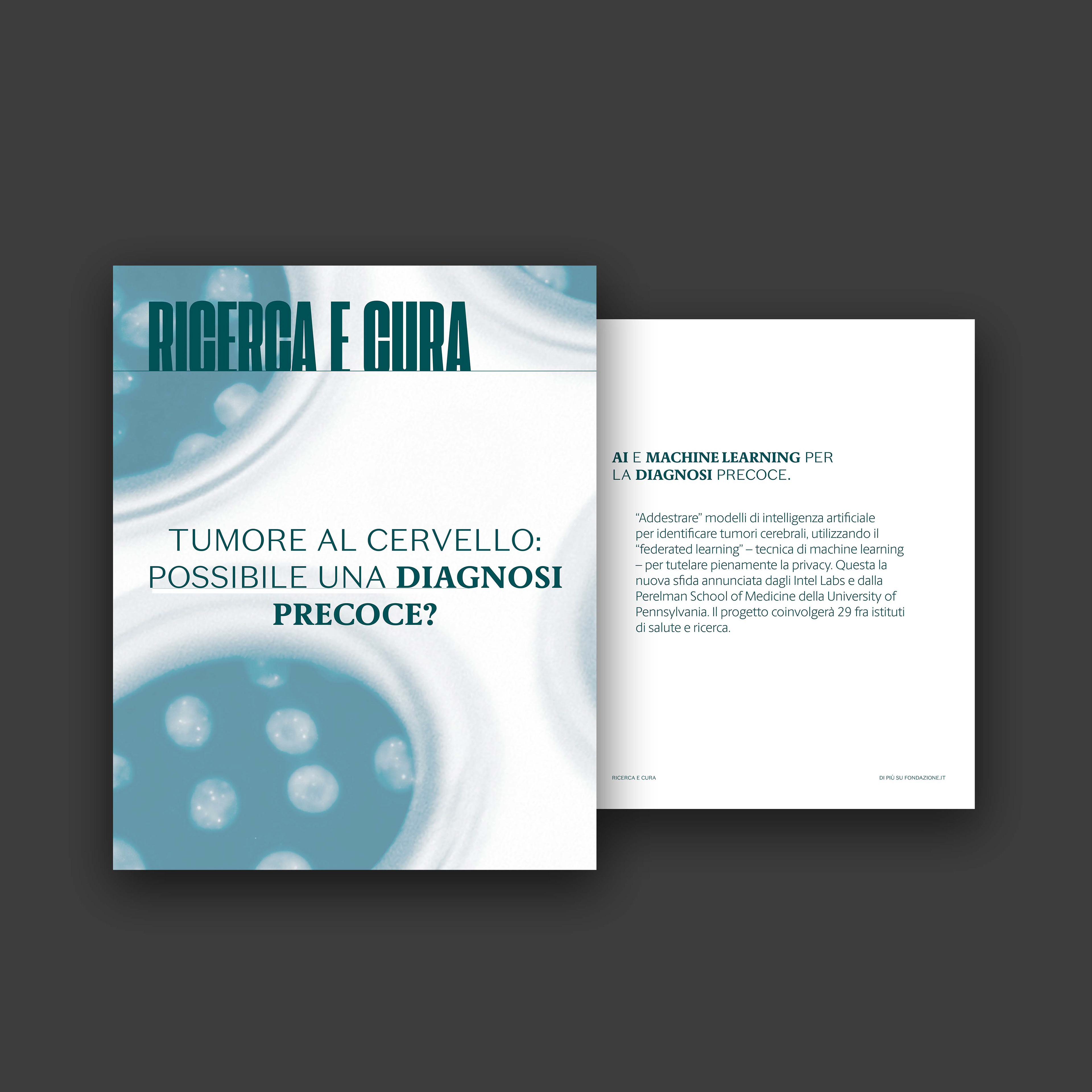
• Research and Care, a space dedicated to the progress of cancer research, starting from the reality of Candiolo and then facing a more international perspective ("News fromworld ") and more technical (" New technologies), up to the great discoveries of the past ("Focus - News from the past").
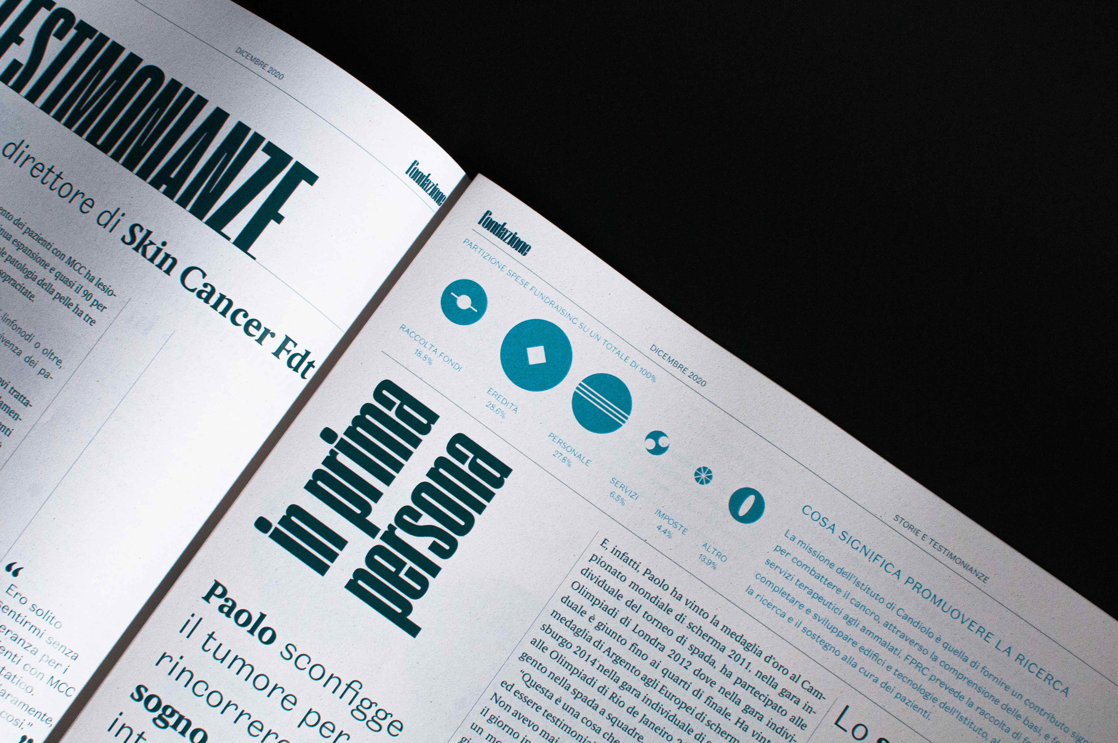
• Stories and Testimonials, a column that collects the words of those who live the reality of Candiolo and intercepts the need for closeness and solidarity towards the target group which includes the families and loved ones of patients, doctors and researchers.
• Health and Wellness, another column that contains advice for a healthy and sustainable lifestyle ("Did you know that?") With particular attention to prevention, alongside a space dedicated to questions from readers to experts in the sector ("Word to 'expert").
• The Chronicles, or the last section dedicated to generic updates by the Foundation about events and external citations.
• Research and Care, a space dedicated to the progress of cancer research, starting from the reality of Candiolo and then facing a more international perspective ("News fromworld ") and more technical (" New technologies), up to the great discoveries of the past ("Focus - News from the past").
• Stories and Testimonials, a column that collects the words of those who live the reality of Candiolo and intercepts the need for closeness and solidarity towards the target group which includes the families and loved ones of patients, doctors and researchers.
• Health and Wellness, another column that contains advice for a healthy and sustainable lifestyle ("Did you know that?") With particular attention to prevention, alongside a space dedicated to questions from readers to experts in the sector ("Word to 'expert").
• The Chronicles, or the last section dedicated to generic updates by the Foundation about events and external citations.
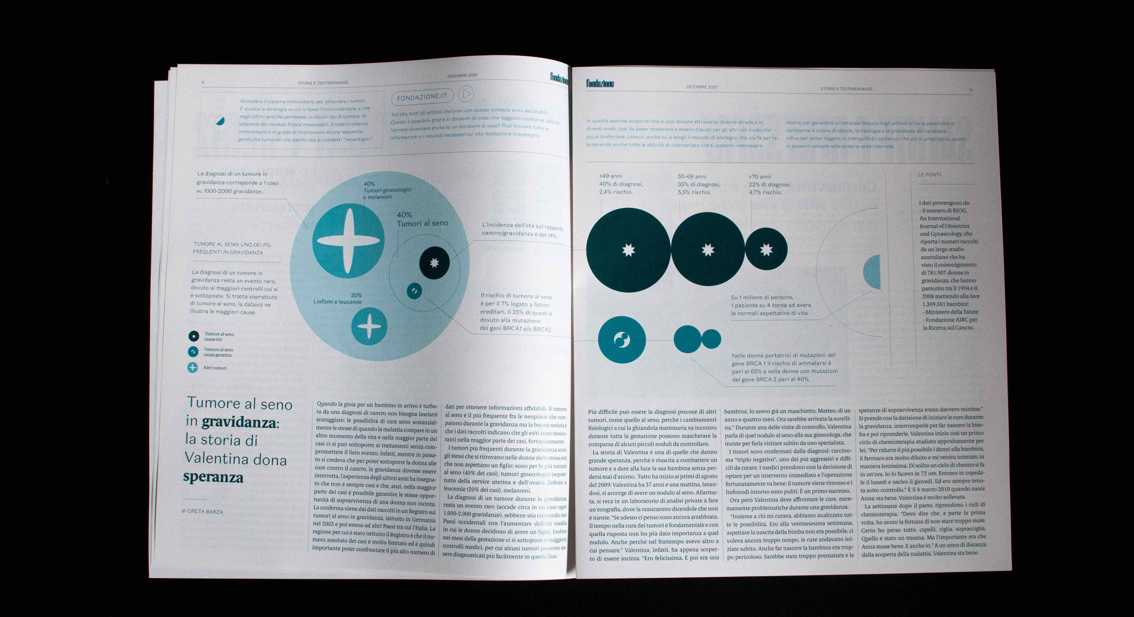
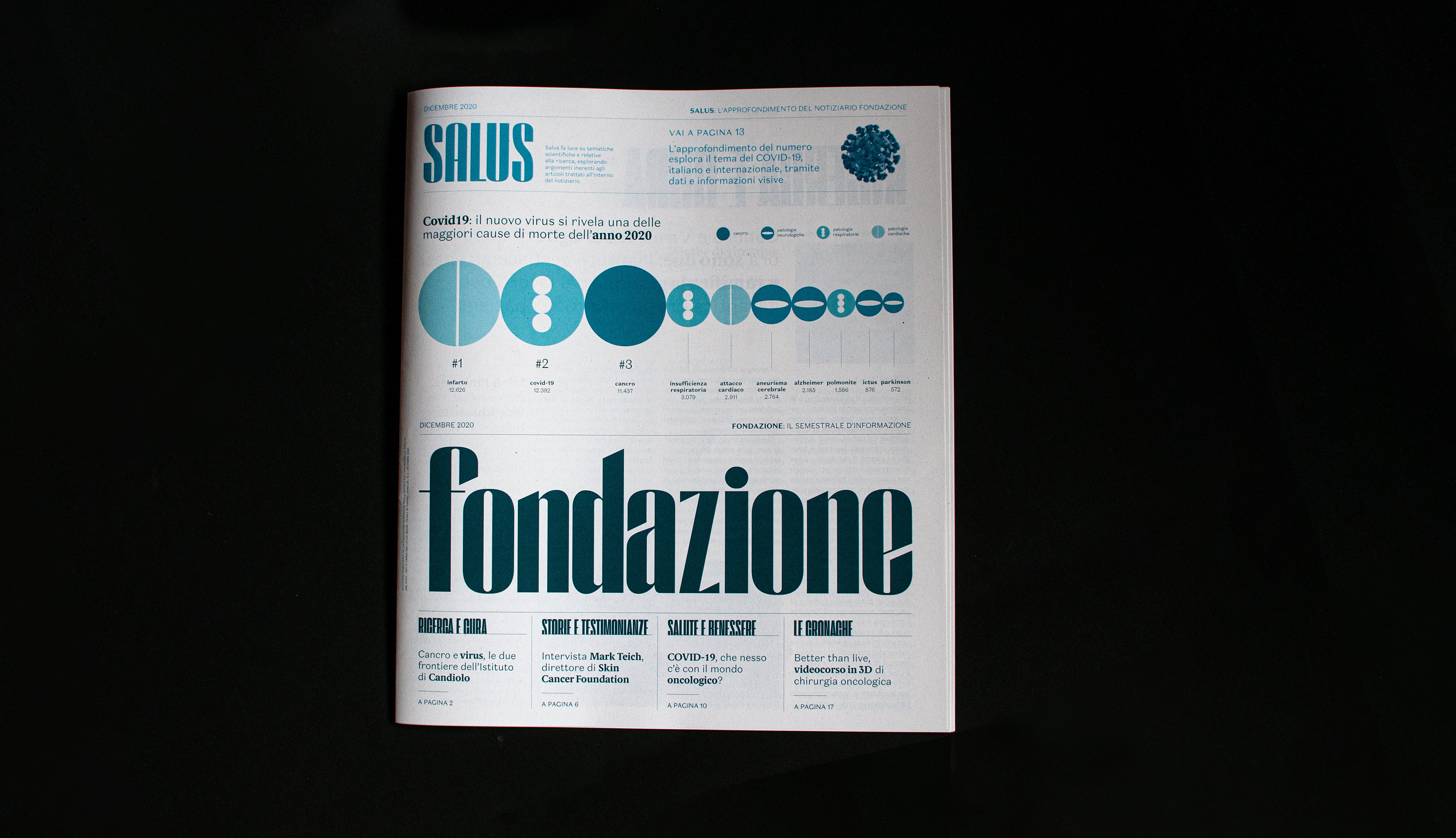
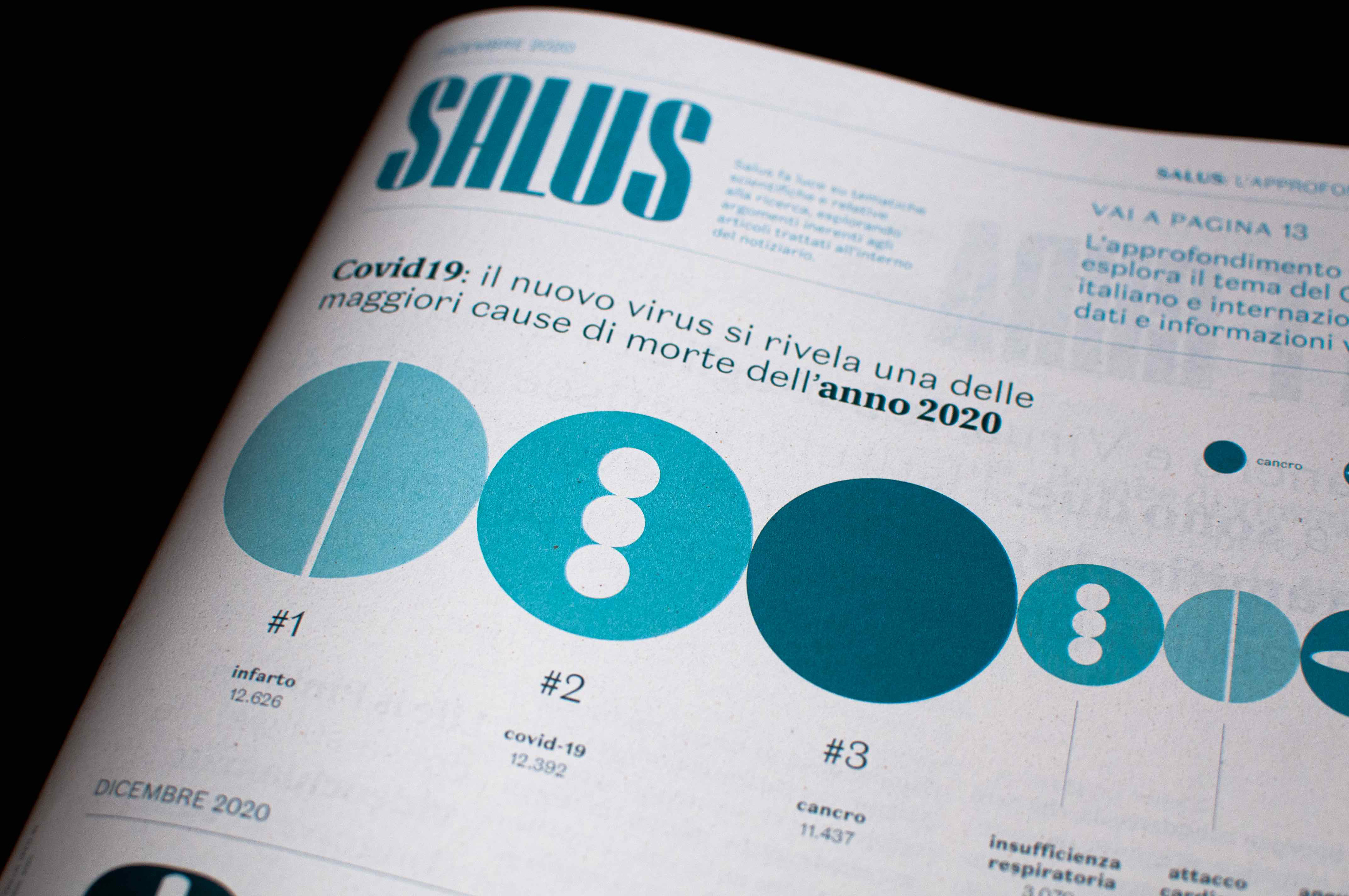
The infographic is a recurring pivotal element in the newsletter, used as a tool to deepen and explain a topic in a clear and visual way. it is in particular the fulcrum that characterizes Salus, the in-depth area that links the sections of the newsletter and stands out for its bright blue color.Salus therefore consists of references to the digital platform and in-depth textual and infographics of topics covered in the articles of the "Foundation".
This deepening finds its way into space as a longform that explores a different topic at each release.
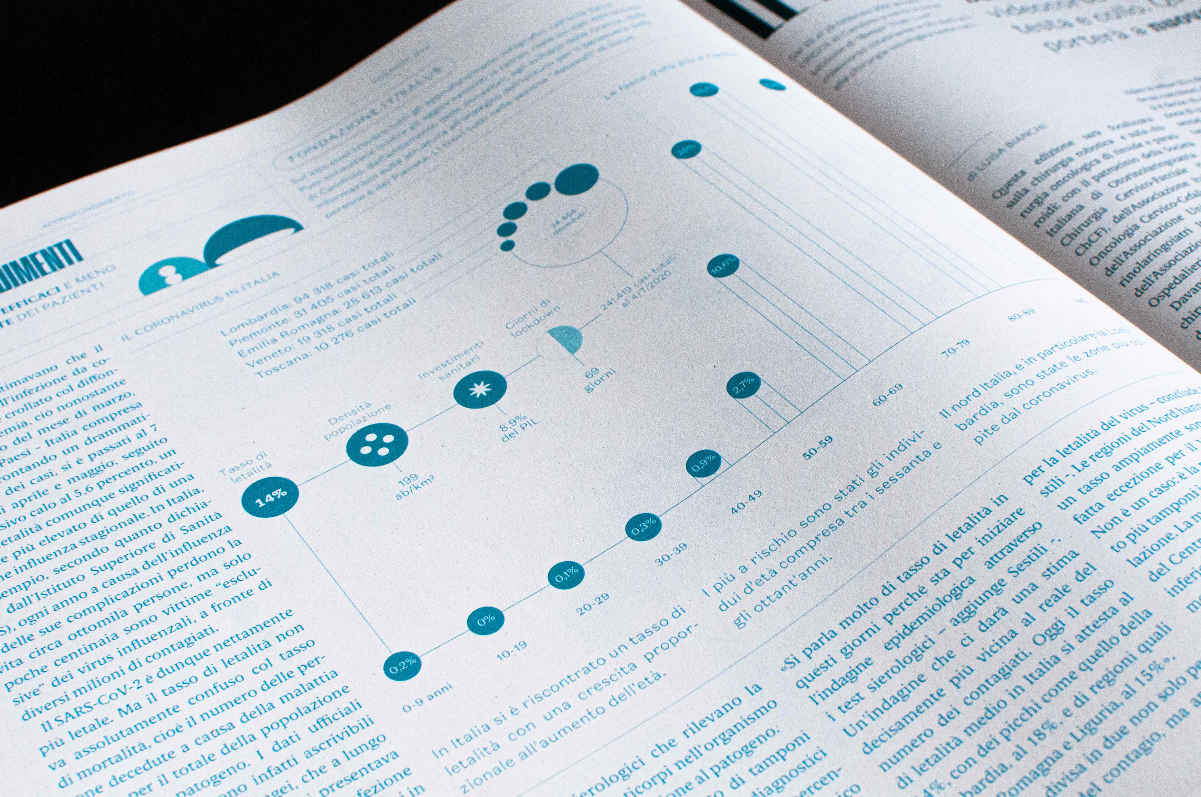
Salus Longform
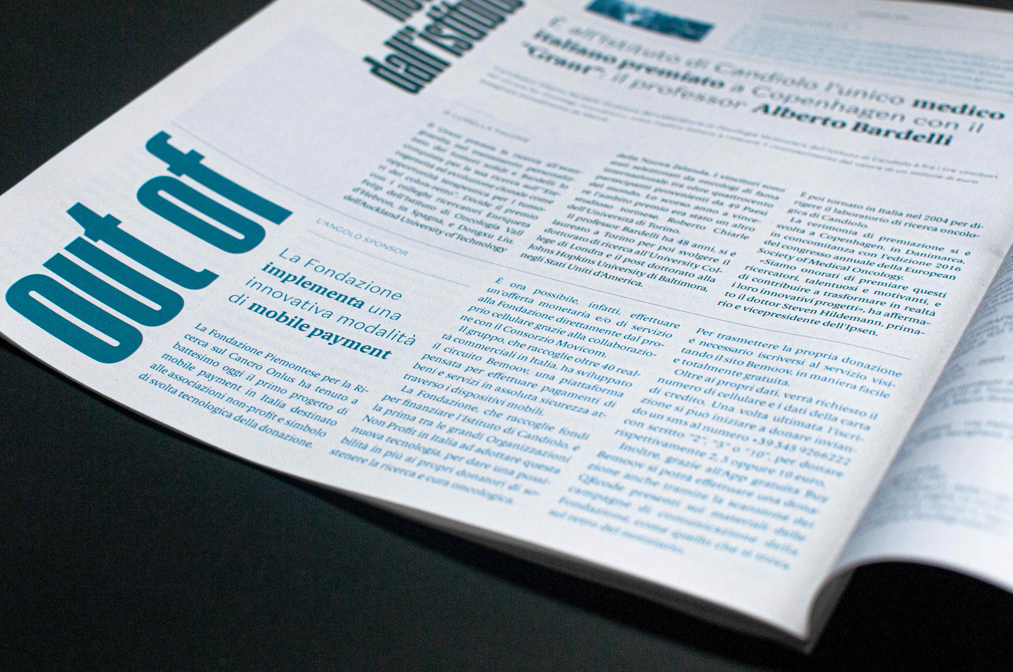
To balance the possible increase in expenditure following the renewal of the "Foundation", the inclusion of advertorial ("Out of - The sponsor corner") was proposed, ie articles born from collaborations between the Foundation and other bodies and companies external. It is a more refined and hidden way of advertising and, at the same time, information.

| a change of perspective
The digital newspaper
The digital newspaper
A web platform was then designed that was the digital reflection of the paper newsletter and that put the key aspect of collectability at the center, managing the contents according to the principles of a real archiving system, both visually and in terms of use. Its main objective is to create continuity of information between one printed issue and another, keeping the reader up to date.
Upon landing on the page, the titles appear partially hidden to emulate the idea of the archive and the typical gesture of consultation. On hovering the mouse, the titles are revealed with an upward movement. On click, the selected tab shows its full content.
As for the articles, they have a double level of selection: at the first click the incipit of the text is revealed, while at the second click the entire article is displayed, with the related customizations of the reading, the possibility to save it and, in some cases, the option to listen to the text.In general, the entire platform is highly customizable, both from the point of view of readability - because it allows users more or less digitally accustomed to use the information in a simple and clear way - and as regards the choice of contents of own sake. Experience that is reflected in the newsletter sent every two weeks, to update subscribers on the news and topics they have previously selected.
As for the interconnection between "Foundation" and "Salus", if in the paper they coexist on the same page in dedicated spaces, on the digital platform they are two distinct entities: the user can comfortably switch from one area to another through a horizontal switch movement, an option present on every page of the site, made possible by a fixed menu that follows the user throughout the scroll of the page.The contents of «Salus» are mainly made up of animated infographics and insights combined with real data and contextualized in the news.The fulcrum of this area of the site are the data walls, which build a narrative for data on topics related to the Foundation that can also be reproduced in some dedicated spaces in the Institute. These topics are: the progress of donations to the Foundation, its commitment to the well-being of people and the environment, the Institute's clinical innovations and research progress.

| all round
The "SALUS" merchandising
The "SALUS" merchandising
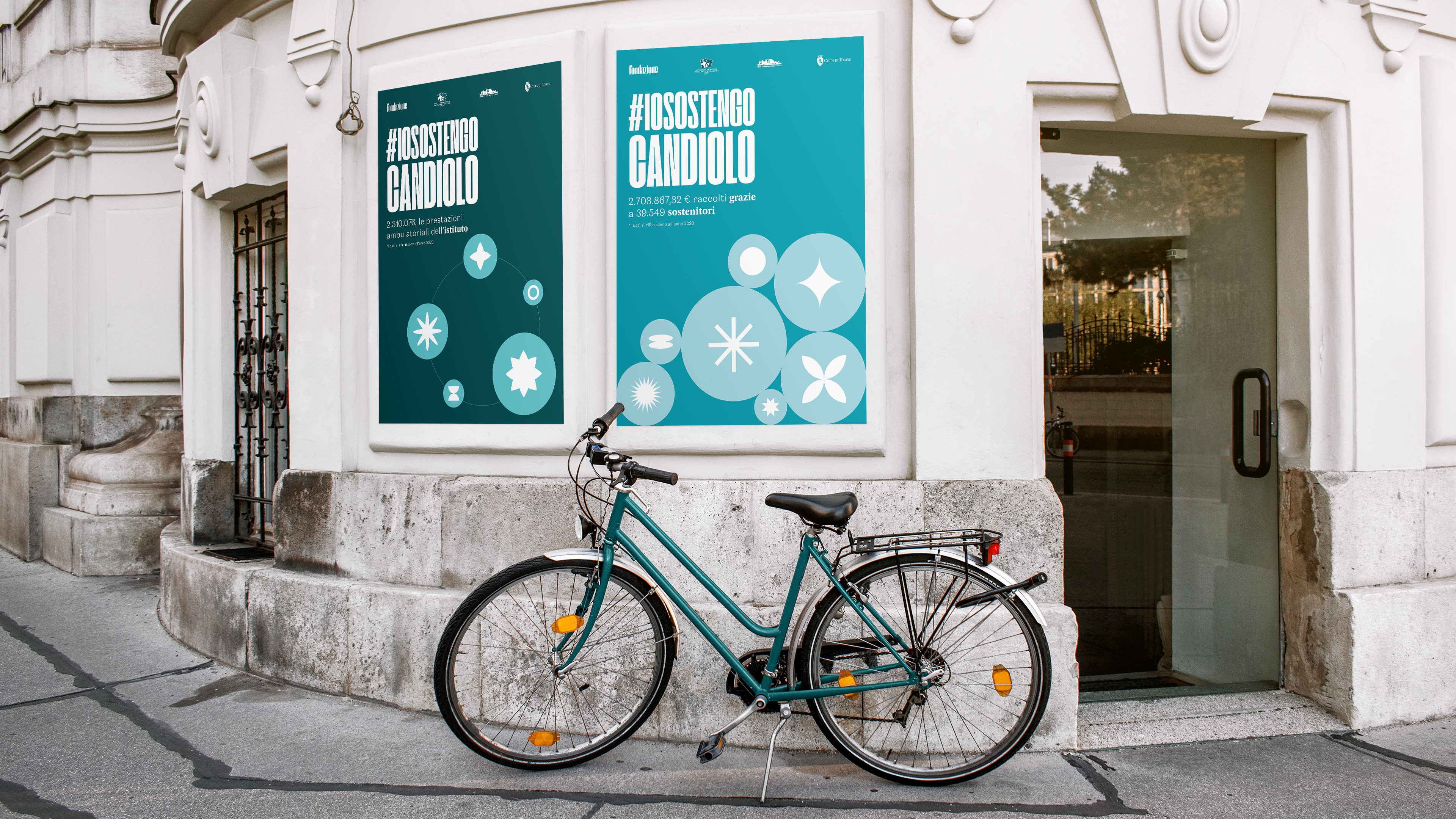
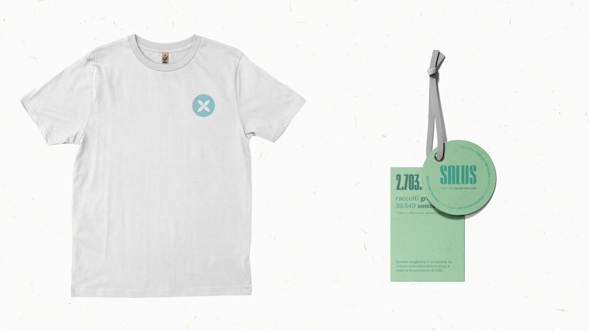
No less important section is that linked to the shop of SALUS branded merchandising products. The budget infographics, following the circular vision of the project, find a second life in the visuals of merchandising. An operation that allows to bring even a younger target closer to the practice of donation.
The t-shirts reproduce the four Dataviz and the related areas of investigation with a circular graphic element on the front and the entire infographic on the back, with a qr that refers to the corresponding section of the site for further information. The label shows the year-end data relating to the area to which the t-shirt refers.
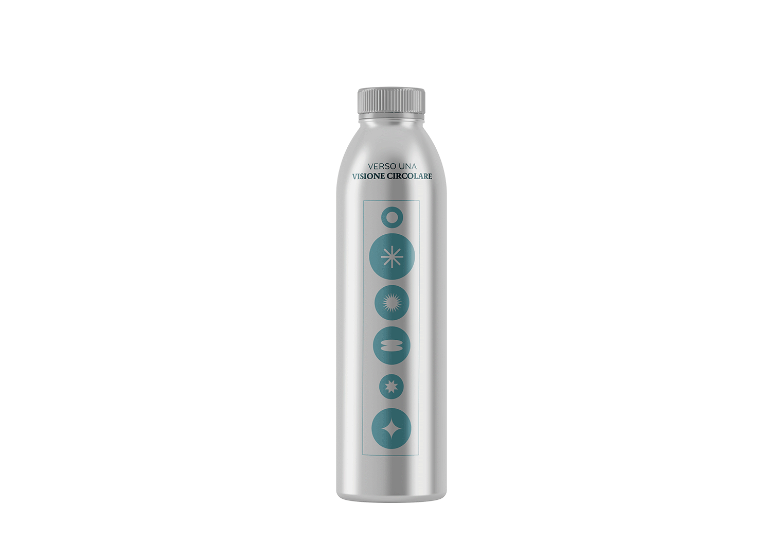
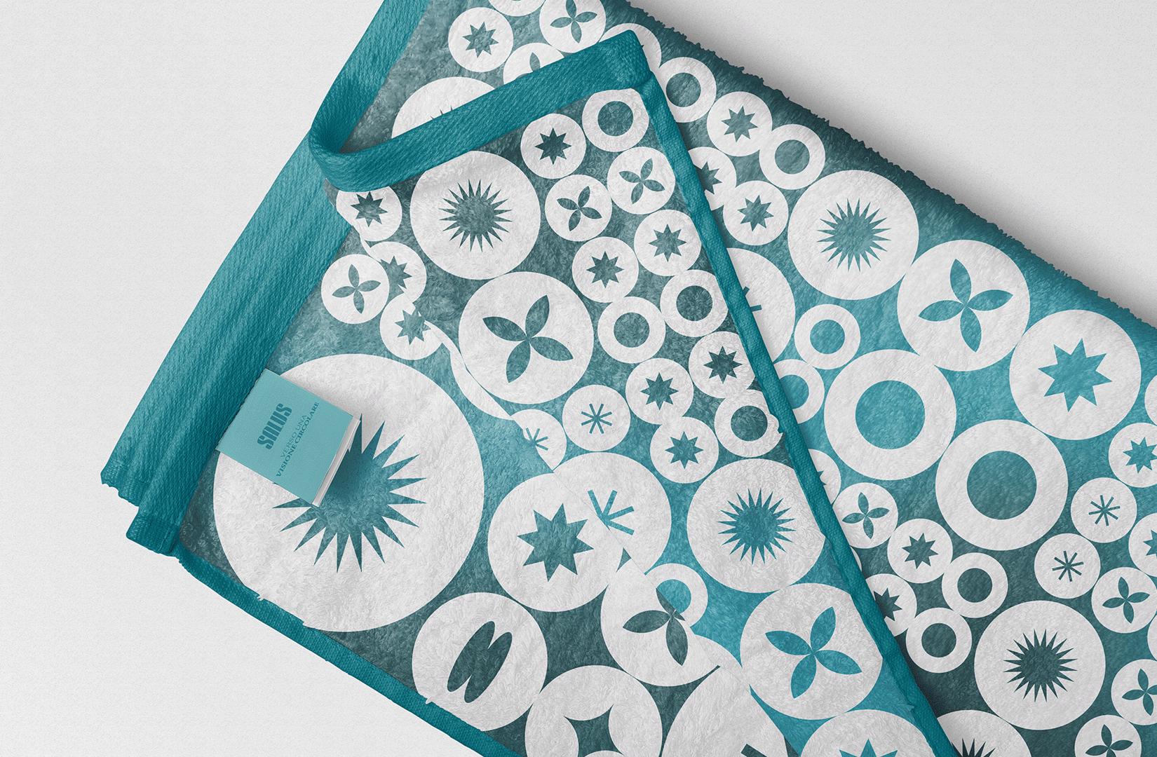
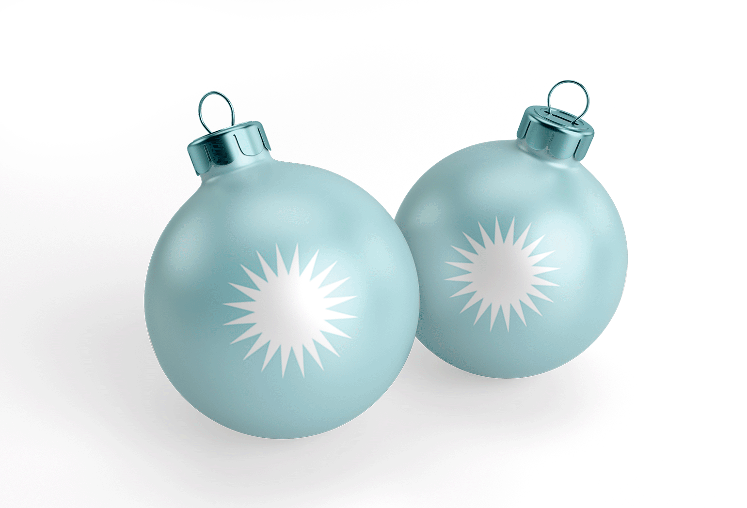
Other items designed for merchandising are water bottles, useful for example for events such as marathons to support research, and other more seasonal products such as beach towels and Christmas balls to support the Foundation during the Christmas holidays.

| how to communicate changes?
Social and ADV Communication
Social and ADV Communication
The communication is aimed at a more social and digital environment, in which different formats for the dissemination of news and news have been designed:
Launch of the periodical "Foundation":it includes two posts: a gif presenting the key themes with a small interior spoiler attached and a post revealing the cover of the current issue.
News. a format that focuses on two types of posts, namely a breaking news carousel, presented as a sort of clipping of the paper newspaper headlines, and a single news item on a hot topic of the moment.
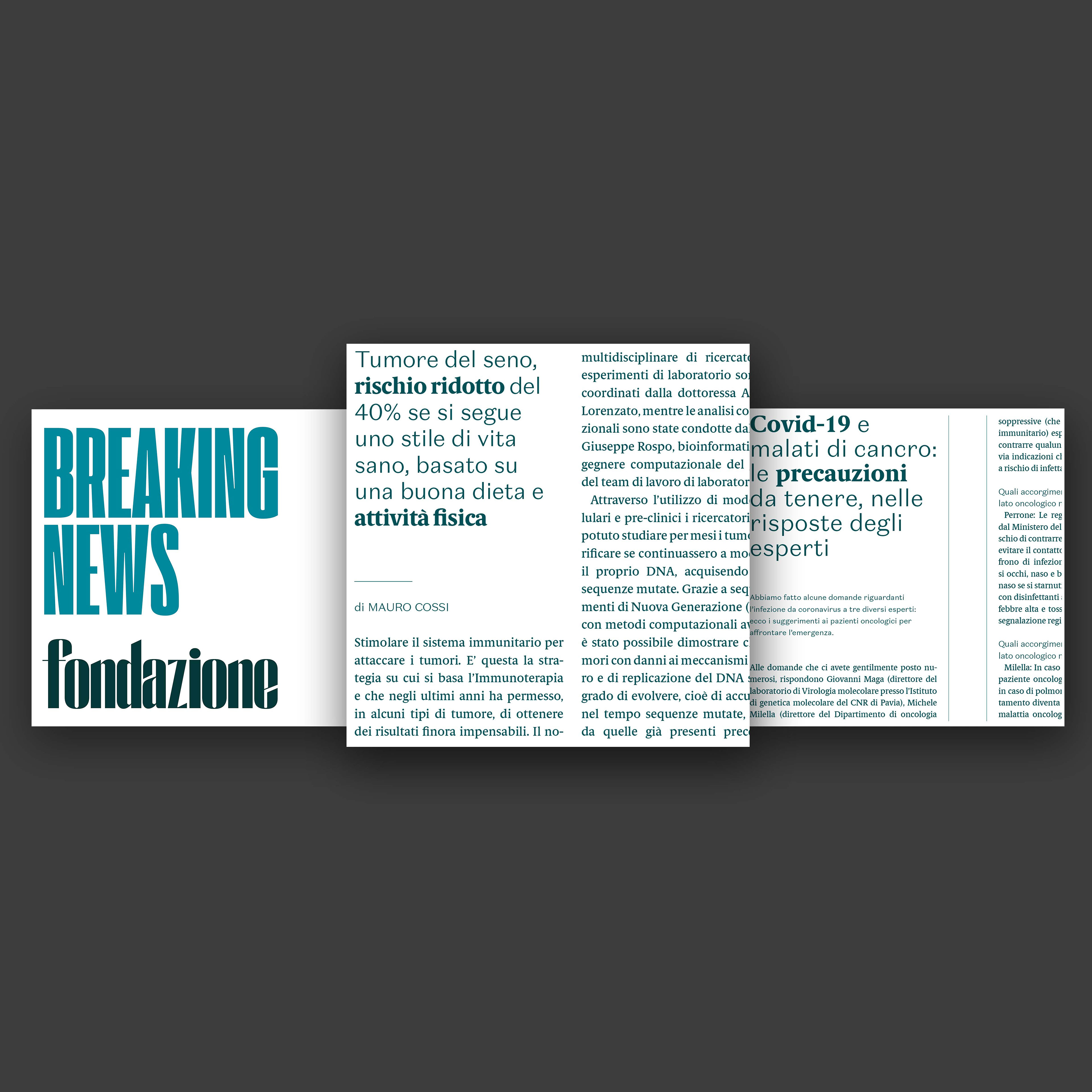

Breaking News
In-depth analysis through infographics

| ADV
ADV Communication
ADV Communication
Traditional paper advertising, on the other hand, focuses on three fronts:
• The communication of the launch of the renewed "Foundation" and of the "Salus" in-depth study
• Sponsorship of future and / or upcoming events
• The final visual balance of the data collected during the year of the four macro areas of investigation of the data walls.
• The communication of the launch of the renewed "Foundation" and of the "Salus" in-depth study
• Sponsorship of future and / or upcoming events
• The final visual balance of the data collected during the year of the four macro areas of investigation of the data walls.